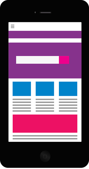
Your Call-To-Action (CTA) needs to stand out on your website so that the visitor knows that clicking on that CTA button is the correct next step for them to take in order for you to be able to assist them in their needs.
If you’re an optician, your CTA would more than likely be a ‘Book Appointment’ or ‘Book Eye Test’ button that is a different colour to the text and background of your website (as in, don’t have your CTA be black and white). Bright and light colours work best such as blue or green. Don’t use colours such as red as it can signify danger or a warning, which can push visitors away from the CTA.
If you can add some form of animation to your CTA it can help increase conversions also. This could be having the CTA slide up from the bottom as your website visitor scrolls to that section of your website. It just adds a further element that catches the eye and draws attention to the next step that you want the customer to take. However, having said all of this, do not make it look spammy or unappealing, there is a balance to be found.
Experiment with A/B testing. This means you can have your CTA as ‘Book Appointment’ one month and the following month if could be ‘Book Eye Test’ (or whatever is relevant to your exact field of expertise) to see what converts best and gets more people through your door to complete an eye test. They can even be contacted for future check-ups which keeps them as your customer and stops them from drifting over to a competitor. It shows that you care.
 10 Things To Help Your Business in 2020
March 20, 2020
10 Things To Help Your Business in 2020
March 20, 2020
 Timely Follow-Up
January 05, 2020
Timely Follow-Up
January 05, 2020
 Clear Call-To-Action (CTA)
January 05, 2020
Clear Call-To-Action (CTA)
January 05, 2020
 Mobile Responsive Website
January 05, 2020
Mobile Responsive Website
January 05, 2020

