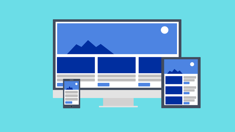
Mobile Responsive Website
Google has confirmed that more than 50% of search is now mobile and as a result, Google has actually penalised search rankings for non-responsive websites for a few years now.
Google tracks what is known as the ‘bounce’ rate. This is measured if a customer clicks on your website and leaves quickly, or ‘bounce’ right back to the search results page to visit the next health and wellbeing specialist website (your competitor) who may have a more user-friendly website. We all know how annoying and frustrating it is when you land on a website using your mobile phone and you need to ‘pinch and zoom’ to get the information you are looking for. Remember, we live in the information age, your potential clients want that information as quickly as possible.
Make sure they can quickly and easily get that information about how you can help them.
Have a look at the image beside this paragraph of text. You can see that no matter what device or screen size that your website visitor is using, the website adapts to the screen size, creating an enjoyable user experience.
At the end of the day, you are looking to drive conversions on your website. The actual conversion is different for each business, this could be getting more phone calls, more email enquiries, more appointments booked, more products sold, etc. This is whatever is important to your business at the time of implementation.
If for example your current business goal was to have more new customers book an appointment on your website, if that website visitor needs to zoom in on every page, either to see what the date and time they are trying to book or enter payment information upfront, they will get frustrated very quickly and go straight to your competitor, even if they have to travel further. Don’t let this happen to you, keep your clients and keep them happy.
I honestly cannot even begin to stress how important having a responsive website is. Just to reiterate, that means that your website will look and function beautifully if the visitor is on a desktop computer, laptop computer, iPad or other tablet, mobile phone, etc. Some people may even view your website on a desktop computer while at the office and do some further research when they get home by viewing your website on their mobile phone. They need to have the same enjoyable experience on their phone as they did on their desktop computer.
Have you ever been on a website and couldn’t find what you are looking for? So have every single one of your clients, which is why your website needs to have easy navigation, so let’s have a quick chat about that on the next page so that we can drive happy customers to you.

